choosing paint in your living room
It took me 2 whole days to name my son, so needless to say, making decisions is not my strong suit. While painting a room in your home isn’t quite the same level of pressure as naming a newborn, it can definitely be stressful. The cost of paint and labor can add up, so you want to make sure to do it right the first time. So how do you know how to pick that perfect color for you living room? I asked Stephanie, our resident Master Color Consultant, for her top considerations for choosing a paint color. Check out Steph’s awesome advice:
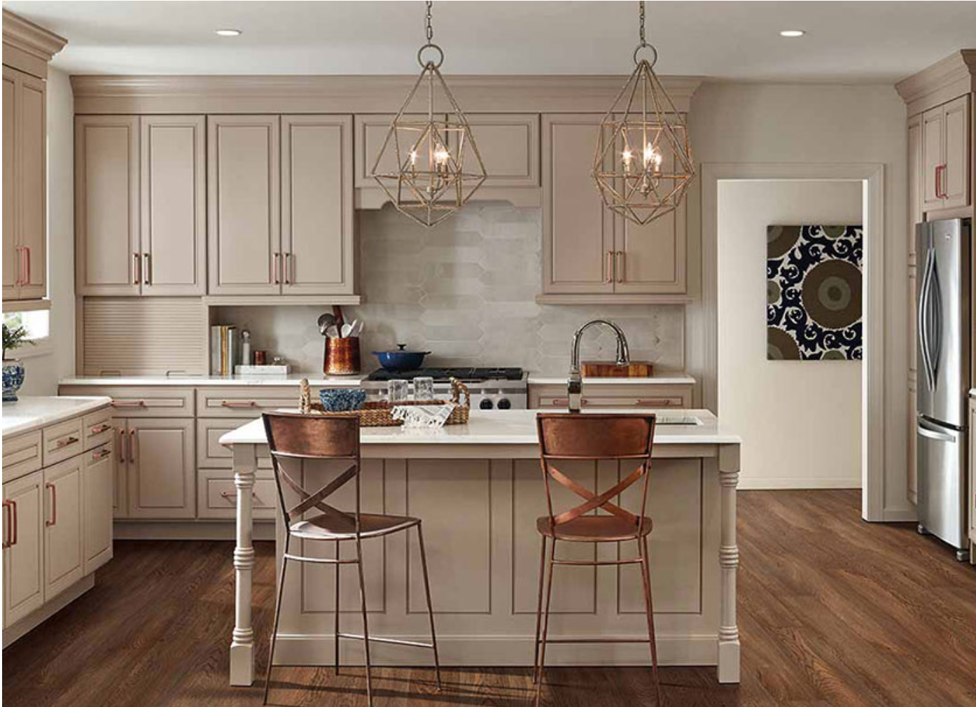
Tip 1: Rely on your existing surfaces as your initial guide. Take cues from things like flooring (hardwoods, carpet, and tile) and kitchen surfaces (cabinets, counters, and backsplash), as these are much harder to re-do than paint color. Rule of thumb - try to stay in the same color temperature, meaning warm and cool. Warm colors have hints of red, orange, and yellow (think peach, tan, and cream). Cool colors have green, blue, and purple undertones (like greys).

Above photos from HERE and HERE
Tip 2: Consider your lighting, both natural and artificial. Is your room full of bright natural sunlight from windows on all sides? Lighter colors may wash out and lose their depth of tone in a space like this. Is the room darker due to direction it faces, or location in your home? Dark colors are going to appear even deeper there. Southern facing rooms tend to get a warmer-toned natural sunlight, while northern facing rooms will get a grey-blue-toned natural light. Light bulbs also cast different tints - “warm white” = yellower in tone, while “daylight” = bluer hue.
Tip 3: Never paint your room a color because you loved it online! IT WILL NOT LOOK THE SAME in your space. Online photos are filtered, edited, and generally very poor representations of exact colors. Even those on paint color websites can look different in your home, and those differences mean purple walls with you thought you were choosing a soft grey, or yellow when you thought you were choosing an off-white. The. swatches below are all taken from Google Images when I searched “Sherwin Williams Alabaster,” a super popular warm white. See the differences?? It’s insane!


Tip 4: Don’t overwhelm yourself with choices. Narrow down your choices based on the above info, and then I would recommend choosing 2, maybe 3 colors from a palate. Get samples made and paint different large spots all over the room to see how the color looks compared to different existing surfaces and in different light throughout that space. A single wall with 7 swatches of off-white isn’t going to get you any closer to choosing your color, it will just leave you decision fatigued and confused!